

Responsive Real Estate Landing Page


Introduction
This is a portfolio project that demonstrates the development of a responsive landing page for a real estate website. The Responsive Real Estate Landing Page was developed by me as a solo project, where I handled all aspects of the design and implementation. The timeline for this project spanned three weeks, with each week allocated to specific milestones. The landing page is designed to be visually appealing and user-friendly, providing an immersive experience for potential real estate buyers.
Project Inspiration
The inspiration for this project came from my passion for both the real estate industry and web development. I wanted to create a visually appealing and user-friendly landing page that showcases properties in an interactive and responsive manner. By blending my interests, I aimed to create a valuable and practical project for potential users and demonstrate my skills as a web developer.
Technology and Architecture
For the development of this project, I utilised HTML, CSS and JavaScript which are fundamental technologies for web development. In addition, I leveraged the swiper.css and swiper.js libraries to enable smooth and intuitive property slideshows. These libraries provided the foundation for creating interactive elements, enhancing the user experience on the website.
The architecture of the project followed a standard web development approach. The HTML file was structured using semantic tags allowing for better accessibility. CSS was used to style the elements ensuring a consistent and visually appealing design. JavaScript was used to handle the interactivity enabling user engagement.
Key features of this project include:
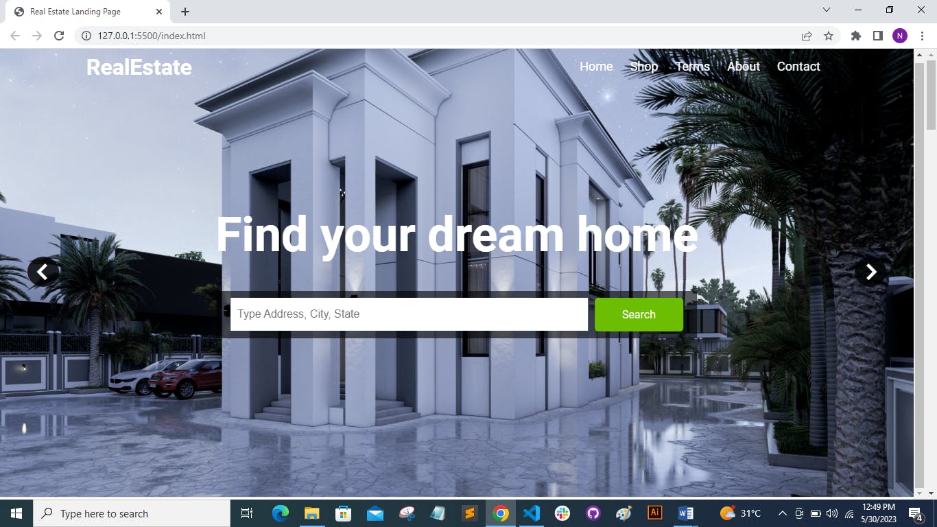
- Carousel functionality: I created a swiper container in the hero section of the web page. Then I used the swiper.js library to initialize the swiper object with the necessary configurations as shown below.
   <!-- Hero -->
      <div class="hero">
        <div class="swiper-container heroslider">
          <div class="swiper-wrapper">
            <div class="swiper-slide">
              <img src="./images/pic1.jpg" alt="" />
            </div>
            <div class="swiper-slide">
              <img src="./images/pic2.jpg" alt="" />
            </div>
            <div class="swiper-slide">
              <img src="./images/pic5.jpg" alt="" />
            </div>
            <div class="swiper-slide">
              <img src="./images/pic6.jpg" alt="" />
            </div>
          </div>
          <div class="swiper-button-next">
            <i class="bx bx-chevron-right swiper-icon"></i>
          </div>
          <div class="swiper-button-prev">
            <i class="bx bx-chevron-left swiper-icon"></i>
          </div>
        </div>
      </div>
const swiper = new Swiper(".heroslider", {
  slidesPerView: 1,
  spaceBetween: 30,
  loop: true,
  autoplay: {
    delay: 2500,
    disableOnInteraction: false,
  },
  effect: "fade",
  navigation: {
    nextEl: ".swiper-button-next",
    prevEl: ".swiper-button-prev",
  },
  pagination: {
    el: ".swiper-pagination",
    clickable: true,
  },
});
- Responsive design: The landing page is designed to be responsive, adapting to different screen sizes and devices. It provides a seamless experience across desktop, tablet, and other mobile platforms. The code snippet below shows a few of the media queries I used to achieve the responsiveness functionality.
@media (max-width: 996px) {
  .header .content h1 {
    font-size: 5rem;
    margin-bottom: 3rem;
  }

  .header .search {
    width: 50rem;
  }
}

@media (max-width: 567px) {
  .header .content h1 {
    font-size: 3rem;
    margin-bottom: 2rem;
  }

  .header .search {
    width: 100%;
  }

  .header .search input {
    padding: 1rem 0;
    font-size: 1.3rem;
  }

  .header .search a {
    padding: 1rem;
  }

  .header:hover .swiper-button-next {
    right: 5px;
  }
  .header:hover .swiper-button-prev {
    left: 5px;
  }

  .swiper-icon {
    font-size: 3rem;
  }

  .swiper-button-next,
  .swiper-button-prev {
    padding: 0.2rem 2.3rem;
  }
}
- User interface and user experience: The design elements are visually appealing, and the page layout is optimised for ease of use.
Challenges Overcome
Throughout the project, I encountered a few challenges. One major challenge was ensuring the responsiveness of the website across different devices and screen sizes. I had to employ responsive design techniques and extensively test the layout on various devices to guarantee a consistent experience for all users.
Some of the key principles and techniques of responsive design that I employed include:
Media queries: These allowed me to apply specific CSS rules based on the characteristics of the user's device, such as screen width, height, and orientation. By using media queries, different layouts and styles can be defined for different screen sizes.
Integrating the d-flex CSS class: This sets the display property of an element to flex. Subsequently, this allows the element to take advantage of the flexbox layout model, which provides a flexible and efficient way to arrange and align items within a container, as shown below.
.d-flex {
  display: flex;
  align-items: center;
}
Additionally, integrating the swiper.js library and customising its behaviour to align with the project's requirements posed some hurdles. However, with thorough research and experimentation, I was able to overcome these challenges successfully.
Learning about Technical Interests
Developing the Responsive Real Estate Landing Page allowed me to explore and enhance my knowledge of frontend development, particularly in creating responsive layouts and implementing interactive features. Working with the swiper.js library expanded my understanding of utilising external libraries to enhance the user experience and simplify complex functionalities.
What I might have done differently was connect my landing page to an API that provides real-time property information. This would make my landing page more practical and up-to-date.
The project sparked my curiosity about UI/UX design principles and best practises. I delved into creating visually appealing interfaces, optimising user flows, and ensuring intuitive navigation.
I gained valuable insights into project management and the importance of setting realistic goals, managing timelines, and maintaining organised documentation. As a solo developer, I had to take responsibility for every aspect of the project, from planning to execution. This experience honed my project management skills and highlighted the significance of effective communication and self-discipline.
Conclusion
In conclusion, this project served as a significant learning experience. I am proud of the final outcome, and I look forward to applying these newfound insights and skills to future projects in order to continue my growth as a developer.
Bio
I am a Graphic Designer and Software Engineer in training, with a background in Natural Resources and Environmental Management. I have ardent interest in acquiring new skills and managing work in an organized manner.